George Kapernaros is the founder and CEO of YOCTO, the #1 retention marketing agency for health & wellness brands. Under his leadership, YOCTO has driven results for over 100 clients including Kilo Health, BetterMe, Heights, Elo Health, Miracare, and Healf; earning a spot on Klaviyo’s Partner Advisory Council and Yotpo’s E-Commerce Advisory Board along the... Read more George Kapernaros is the founder and CEO of YOCTO, the #1 retention marketing agency for health & wellness brands. Under his leadership, YOCTO has driven results for over 100 clients including Kilo Health, BetterMe, Heights, Elo Health, Miracare, and Healf; earning a spot on Klaviyo’s Partner Advisory Council and Yotpo’s E-Commerce Advisory Board along the way. Before YOCTO, George worked on some of the fastest-growing DTC brands in Europe, directly involved in 200+ eCommerce launches across multiple markets. His experience spans agency-side, in-house, and founder-level roles; from running growth strategy at a 100+ person performance brand incubator, to leading conversion content at Kilo Health, one of Europe’s top digital health companies. Outside of client work, George is the host of CEO AFTER DARK, a candid podcast where high-performing entrepreneurs share the real stories behind their rise. He’s also a Reforge member, CXL instructor, and has guest lectured at The Atomic Garden Vilnius, Lithuania’s top advertising school. George holds an MBA and has spent the last decade building and scaling revenue engines that prioritize customer lifetime value. His approach blends conversion psychology with a strong operator mindset. These are just some of the things that have earned George a reputation as one of the go-to retention experts in the health & wellness space. ... Read less
If your idea of email retargeting is the tired old “left something on your cart” email… block out some time and keep reading.
Bringing new traffic to your website costs a lot. But what if I told you that with an (almost) 0$ budget you can bring the same users back? Time and time again, until they buy?
Keep reading and I’ll show you how to transform your website into a mousetrap.
Here’s a common scenario in e-commerce:
Prospects come to your site to check your products. They might visit a couple of pages and then…
…their phone rings.
…or the internet is down.
…or someone speaks to them.
Life gets in the way. So they dump your website and go on with their lives.
Besides that, only a few people are ready to buy when they first visit your shop. They might come and go several times without buying.
So the crucial question is… how will you bring those potential customers back cost-effectively?
Ads cost a lot. We all know that. And though ads have their place, there’s a more efficient way to bring potential customers back.
It’s called automated retargeting email.
Automated marketing emails are sent to remind prospects of the products you offer. Encouraging them to come back and take another look.
For example, most marketers are aware of cart abandonment emails. A cart abandonment email is a form of retargeting email automation. But it’s only one layer of the strategy you’ll learn in this guide.
Retargeting email automation is a vital tool that can bring more money into your pockets — converting prospects interested in your products to buyers, at scale, practically for free.
So, let’s get down to the brass tacks. Let’s look into the strategy and techniques behind high-converting retargeting email flows.
When you finish reading, you’ll know how to turn your e-commerce website into a mousetrap.
This means every website ‘exit’ path deserves its own email automation. And on top of that, each of these email automation requires different messaging.
Where Users Left
Buying Intent
Triggered Automation
If they abandon a Product page
Enable Browse Abandonment automation flow
If they abandon your Home or a Category page
Enable Site Abandonment automation flow
Perhaps you’ve noticed how I didn’t mention cart abandonment. That’s because cart abandonment is actually a misnomer. When people say cart abandonment, they usually refer to checkout abandonment.
(There is, of course, a way to retarget people who exit during the cart page. Here’s a simple, low-tech guide to building that automation through Klaviyo and Shopify.)
But the bottom line is simple. You need new email automation for the exit paths of your website. The further down the exit path funnel (homepage, category, product, cart, and checkout page) the user is, the higher their buying intent.
Therefore, each of these email automation requires custom messaging.
Everything starts with a strong welcome flow. Here is a free step-by-step guide on how to build high-converting welcome flow automation.
What makes retargeting emails so significant? Well, here are some reasons:
We’ll discuss in detail about:
After that, I will show you in detail how to build the 3 most useful retargeting flows, step-by-step, with checklists and visual examples.
If you are tired of baffling how-to guides, keep reading. We have done our best to create a complete and clear guide that spells out everything you need to know about retargeting emails.
The discount ladder is an advanced marketing technique that fits perfectly into retargeting email strategies.
The idea behind discount-ladder is that you offer a series of increasing discounts until users actually make the decision to buy.
Let me give you an example of it:
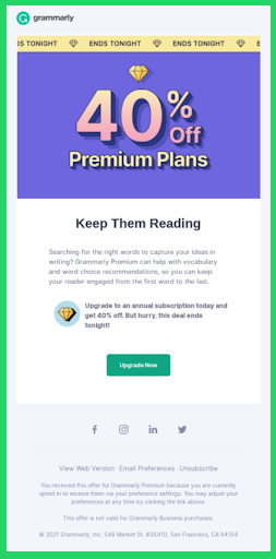
Discount ladder step 1: You begin with an email that offers an extra -10% discount on a product/ cart value.
If the user doesn’t make a purchase after (x) days…
Discount ladder step 2: You send a 2nd email with a bigger discount e.g. -15%.
If the user still hasn’t placed an order after (x) days…
Discount ladder step 3: You can go on by emailing an even bigger offer such as -20%. It practically works as a decision-driving purchase incentive.
Obviously, this only makes sense if your margins can afford it. Use common sense.
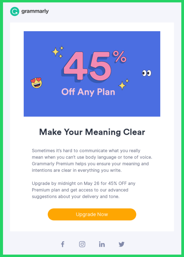
Keep in mind that discount ladders are not only about discounts.
You can also offer free shipping, a gift-with-purchase, samples, or any other incentive that can go along with your products.
The main point is to keep increasing the perceived offer until the shopper decides to make a purchase. Every step of the ladder should contain a better deal than the previous one.
The moment a user places an order, they “fall off the ladder,” which means that they stop receiving those discount emails, as they have already accomplished our goal.
It may take several tests on various levels and timings of the ladder to find the perfect fit for your shoppers before optimizing the process. But the main goal is to offer the ideal discount at the right time, to lead your customers to purchase while maintaining maximum margin.
Note: Remember to deactivate or at least adapt these discount emails during seasonal sales. For instance, during the Black Friday period. Offering a 30% discount sitewide & then doubling down with offer-ladder emails is excessive and gives off mixed signals.
What is even better about the discount ladder is that it can also be successfully used in encouraging user behavior outside of retargeting flows.
For instance, for driving retention.
When a user’s activity decreases, you can target them with another discount ladder in order to lead their next purchase and drive up revenue.
Not all users who abandoned your website are the same.
Some might be newbies that just heard about your brand and are thinking about placing their first order.
Some might be loyal shoppers that came back to take another look at your products and, maybe, prepare themselves for their next purchase.
So you shouldn’t treat them the same. Depending on their purchase history, you can divide them into 3 groups:
And deliver custom messaging and discounts when they enter your retargeting flows.
For example, you can offer an expiring coupon as an incentive to a 1st-time buyer. But if you keep doing this to people who have already bought, they will simply wait for the coupon to make their next purchase.
So, when you build the strategy behind retargeting emails, keep in mind that you shouldn’t treat all users the same.
Delivering highly relevant content is key to bringing users back to your shop.
A powerful tactic to increase messaging relevance is delivering personalized emails based on the products users viewed or added to their cart or started to checkout with.
Let me explain.
Let’s say you sell sports equipment and a user viewed a pair of running shoes. You can deliver an email that will remind them of the special features of these specific shoes that will upgrade their running performance.
And here is how you can do that: You can build custom retargeting emails that remind users of the benefits of the products they viewed or were interested in buying.
Of course, it’s not efficient to granularly create a different email journey for each one of the thousands of products you sell.
A best practice is to create custom product-benefit retargeting emails only for your top sellers. Another option is to create a differentiated email journey for each product category ( = meaningfully different use case) you offer.
If your retargeting efforts haven’t converted the user even after a series of personalized emails and purchase incentives (e.g. limited-time discounts), don’t miss the chance to ask them why.
Understanding your customers’ decision drivers and pain points is the best way to increase empathy and improve the whole experience you offer them.
So, you can create an automated feedback loop by sending a survey email and asking shoppers why they hesitate to try your products.
Based on these data, you can once in a while tweak your segmentation and email content delivery to create an overall better experience for your audience.
Now you are familiar with the main tactics that form a successful retargeting strategy.
So, let’s go to the nuts and bolts of building the 3 retargeting flows that will turn your shop into a mousetrap:
#1 Checkout Abandonment Flow
#2 Browse Abandonment Flow
#3 Site Abandonment Flow
When a user has products on the cart and begins the checkout process but leaves before purchasing, we have a checkout abandonment.
As we mentioned before, the reasons for abandoning the checkout process may vary. So, it’s very likely for those users to come back and complete their purchase if we remind them about it.
Let’s check how to set up this flow.
According to the setup in the picture, users will enter this flow if they begin the checkout process and abandon it.
In order for this flow to be more efficient, we set up a couple of filters. Only users who:
Here is a graph with all the details you need to keep in mind when creating content for users who abandoned their checkout.
In this flow, you are about to target people who are very likely to buy. So, a hard-selling language would be more efficient in driving purchases.
To increase the chance of a purchase, you should send at least 3 retargeting emails within 24 hours of checkout abandonment.
Now, let’s go through the details of the 6 must-have emails for this flow.
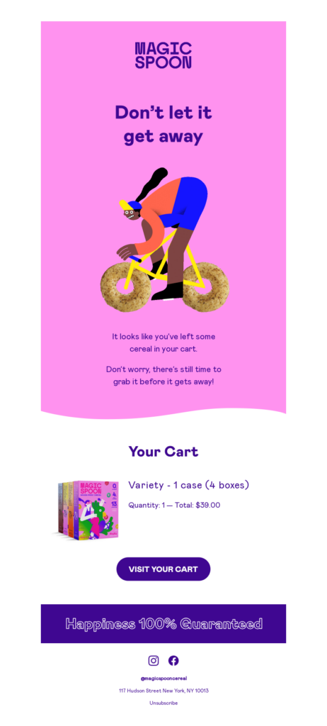
Checkout Abandonment Flow Email 1:
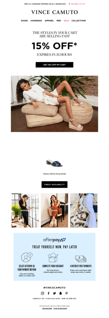
The one with the classic “You left smth on your cart” reminder
Content checklist:
Technical setup:
Checkout Abandonment Flow Email 2:
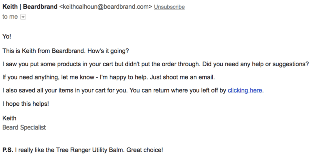
The one that points out the key benefits of the best-selling product or the product category users chose to buy.
Content checklist:
Technical setup:
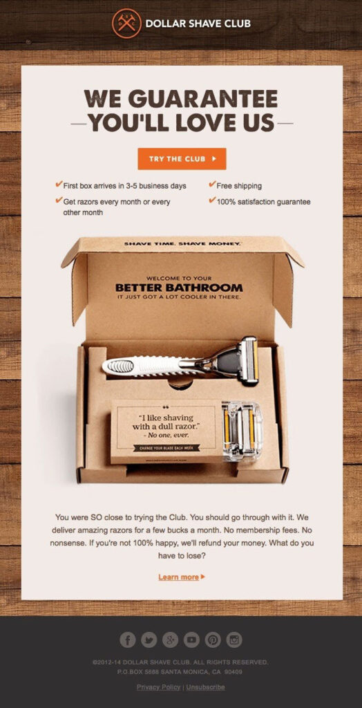
Checkout Abandonment Flow Emails 3-5:
The ones in which we use the discount ladder tactic.
Content checklist:
Increasing discounts example:
Email 3: Discount x (e.g. -10%)
Email 4: Discount x reminder
Email 5: Discount x plus (e.g. -15%)
Tip: Take into consideration your margin to offer the maximum possible discount without annihilating your profits.
Consider not sending these emails to people who’ve already purchased once through a discount. We don’t want to train people to shop only through discounts.
Technical setup:
Checkout Abandonment Flow Email 6:
The one with the survey about why users didn’t buy.
It’s a smart way to create an instant feedback loop from users that began their checkout process but never went back to finish it.
This feedback can be useful in understanding which of their expectations weren’t met and what are their decision drivers.
Content checklist:
Technical setup:
When users view and abandon a product page, they enter the browse abandonment flow.
In this case, users’ buying intention isn’t strong.
Yet, it’s important to maintain the products on top of their minds and make them come back to take another look
Let’s see how to set up this flow.
So, this flow is triggered when users view a product page and then leave.
As you can see, there are 4 activated filters. In order for a user to enter this flow, they should:
If any of the above conditions change, then the user exits the flow.
For example, if a user visits a product page of the website but has already completed a purchase 2 days ago, they will not enter this flow.
These filters are the key to reassuring that your marketing emails will not tire users. That last filter, in particular, is especially important. When people shop online, they often revisit a product page in the days after their purchase. Which would normally place them in the flow again. But thanks to our last filter, this won’t happen.
Now that we have set up the flow triggers and filters, let’s move on to content creation.
In the graph below, you will find all the details you need to remember for this flow.
You are about to target people with lower buying intent. So, it’s better to avoid a salesy tone of voice.
Yet, the goal is still one: to remind them about your brand and the products they were looking at, bring them back to your website, and have them buy.
Here is the complete checklist on what emails to include:
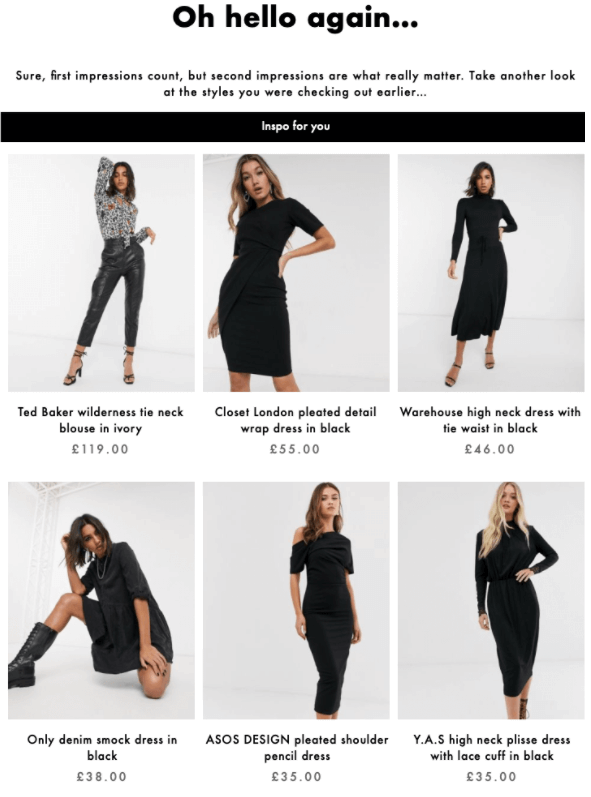
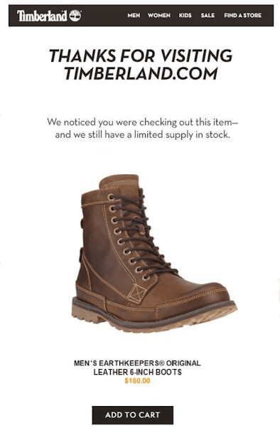
Browse Abandonment Flow Email 1:
The one with the reminder about the product users were looking at.
Content checklist:
An advanced technique to increase the relevance of your browse abandonment retargeting is to customize the email content based on the number of products each user has viewed.
Technical setup:
Browse Abandonment Flow Email 2:
The one about the key benefits of the product/ product category users abandoned.
Content checklist:
Technical setup:
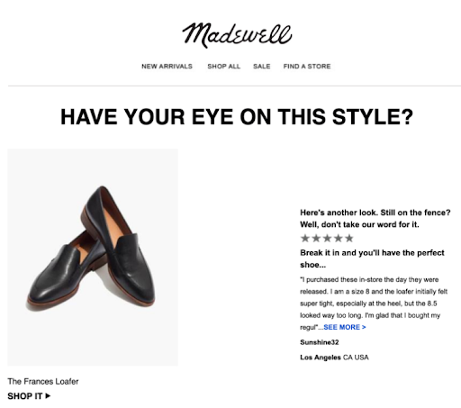
Browse Abandonment Flow Email 3:
The one with the purchase incentive.
Content checklist:
Technical setup:
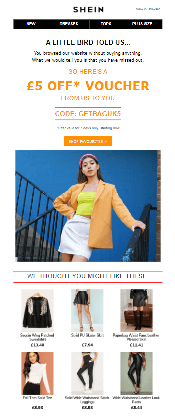
Browse Abandonment Flow Email 4:
The one with the reminder of the discount coupon.
Content checklist:
Technical setup:
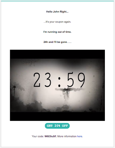
Last but not least, you can retarget users that just jumped into your shop and left in order to bring them back.
Site abandonment flow is activated when a user visits a category page or the homepage of your shop and then leaves.
Let’s see the details behind setting it up.
Users will enter this flow if they were active on site and left.
Filters here help us make sure that we will exclude users who have already entered other retargeting flows.
So, only users who:
Will enter this flow.
Plus, we will only target users who have not been in this flow for at least 4 days.
Now that you know how to set up the flow, let’s move on to the content.
Users in this flow have a low buying intent. They just came into our website and left quite early without any further interaction.
Our main goal here is to incite behaviour that will add them to one of our other flows.
So, with these emails, we aim to lead users back to our shop and make them visit a specific product page. If they do so, they will enter the browse abandonment flow.
And how will you achieve that?
By showing off your most loved products and reminding shoppers why people love your brand.
Let’s take a closer look at the particulars behind the content in this flow:
Site Abandonment Flow Email 1:
The one where you demonstrate your best-sellers.
Content checklist:
Technical setup:

Site Abandonment Flow Email 2:
The one about the values and differentiators of your company + featured popular products.
Content checklist:
Technical setup:
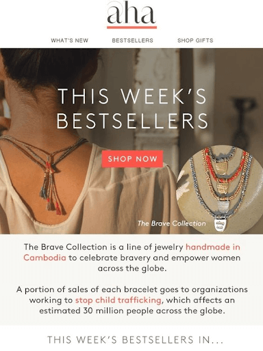
Every time users receive your email in their inbox, they practically get a reminder about the existence of your brand. Even if they don’t open all your messages, you gain mindshare.
With every email you send, there is a series of micro-conversions users go through until they finally land on your website again.
So, even if users don’t open all of your retargeting emails, they get a constant reminder that your products are there waiting for them.
Every email is an opportunity to push them down the funnel and bring them one step closer to purchase.
The truth is that setting up the process we described in this post can be highly complex and technical. It’s very common that most marketers are not familiar with such perplexing automation flows.
So, use all the above guidelines to improve the automation you already own at the level you can.
And if you need extra support to create even more advanced retargeting flows, consider hiring an experienced email marketing agency like us to support you.
If you found this post interesting or worth reading, spread the word.
We can audit your automation flows and offer a custom solution that will outperform your current setup.
Do you need
to maximize your
profits?
