George Kapernaros is the founder and CEO of YOCTO, the #1 retention marketing agency for health & wellness brands. Under his leadership, YOCTO has driven results for over 100 clients including Kilo Health, BetterMe, Heights, Elo Health, Miracare, and Healf; earning a spot on Klaviyo’s Partner Advisory Council and Yotpo’s E-Commerce Advisory Board along the... Read more George Kapernaros is the founder and CEO of YOCTO, the #1 retention marketing agency for health & wellness brands. Under his leadership, YOCTO has driven results for over 100 clients including Kilo Health, BetterMe, Heights, Elo Health, Miracare, and Healf; earning a spot on Klaviyo’s Partner Advisory Council and Yotpo’s E-Commerce Advisory Board along the way. Before YOCTO, George worked on some of the fastest-growing DTC brands in Europe, directly involved in 200+ eCommerce launches across multiple markets. His experience spans agency-side, in-house, and founder-level roles; from running growth strategy at a 100+ person performance brand incubator, to leading conversion content at Kilo Health, one of Europe’s top digital health companies. Outside of client work, George is the host of CEO AFTER DARK, a candid podcast where high-performing entrepreneurs share the real stories behind their rise. He’s also a Reforge member, CXL instructor, and has guest lectured at The Atomic Garden Vilnius, Lithuania’s top advertising school. George holds an MBA and has spent the last decade building and scaling revenue engines that prioritize customer lifetime value. His approach blends conversion psychology with a strong operator mindset. These are just some of the things that have earned George a reputation as one of the go-to retention experts in the health & wellness space. ... Read less
A good sign-up form (also called an opt-in form or a pop-up) is the starting point for an effective email marketing strategy. Smart use of klaviyo sign-up forms can entice people to join your email list, taking them one step closer to becoming a customer. On the other hand, poor use of your sign-up form can put people off your brand, so it’s a fine line. A compelling sign-up form is more important than you think—get it right and you’ll see how it levels up your email marketing game!
Sign-up forms serve as the gateway for converting website visitors into engaged email subscribers. Each month, the average e-commerce store loses at least 1.5% of their email list due to unsubscribes or cleaning their lists of unengaged subscribers.
So replenishing your engaged audience is always necessary. The best way to make sure your subscriber base is growing faster than it’s shrinking is to bring in new active profiles through your email signup form. More subscribers = more sales = more revenue.
“But don’t pop-ups annoy users?”
Not as much as you think. If you were browsing something with the intention of buying it and you were given the chance to save money on it, would you be annoyed? Obviously not.
While a sign-up form may annoy some users (usually those with lower buying intent), they’re offering value to those who are more likely to buy. The key to consistent subscriber list growth is using them effectively, starting with what kind of form you choose.
Not all sign-up forms are the same. Choosing an appropriate one depends partly on your website design, and partly on your email goals and business objectives.
Full-page sign-up forms usually have higher engagement rates and conversion rates than other forms. This could be because they dominate the user’s screen, for maximum visibility and engagement.
According to Klaviyo, full-page forms outperform pop-up, flyout, and embedded forms.

Pop-up forms can be triggered by various actions, like time spent on a page, scrolling a certain distance, or intent to exit. This flexibility allows marketers to present the form at the most opportune moment to capture user information.
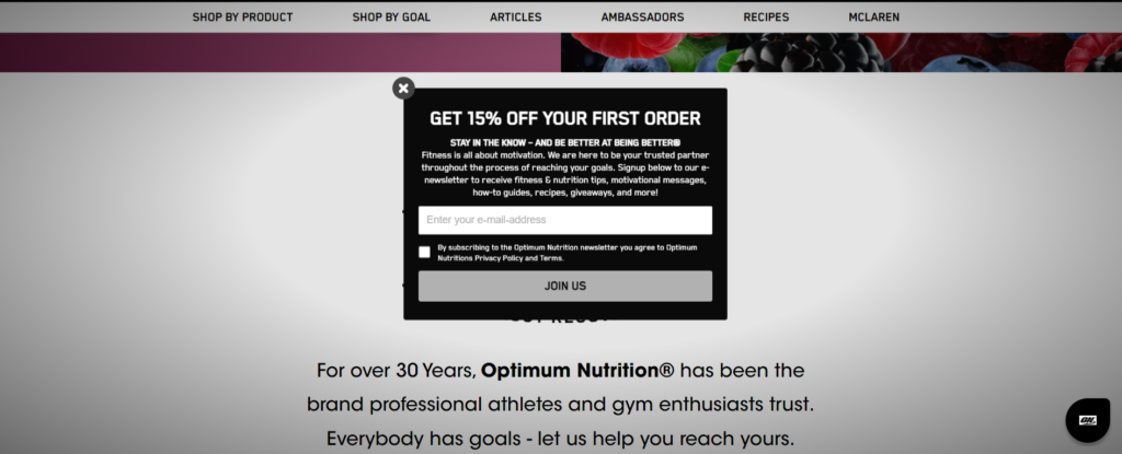
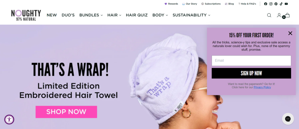
Flyout forms slide into view from the side of the screen. They’re less intrusive than pop-ups and are particularly effective on mobile devices where screen space is limited. These forms can catch the visitor’s attention without disrupting their browsing experience.
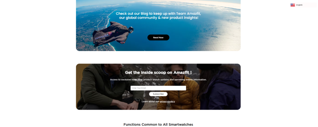
Embedded forms are static and positioned within the content of a webpage. They blend seamlessly with the page design, so they’re ideal for blogs, product pages, and other content-rich sections where the sign-up form complements the user experience.
Dedicated landing pages focus exclusively on capturing visitor information. These pages are tailored for specific campaigns (often ads, sometimes emails) and provide a clear and compelling call-to-action that drives sign-ups. Landing pages are highly customizable, allowing for a cohesive branding and messaging strategy.
Regular audits of your Klaviyo sign-up forms help you stay on top of best practices and to meet the ultimate goal of pop-ups: to target as many visitors as possible in a way that’s least intrusive on their user journey, with a compelling offer that matches their behavior. Auditing your current sign-up form is where this begins.
Find your sign-up forms by navigating to “Sign-Up Forms” in the left-hand menu on Klaviyo. Click on the form you’d like to audit and click the “Edit Form” button in the top right-hand corner.
Most people’s buying intent differs depending on the traffic source (ie. where they came from) and the actions they take once they’re on your website. Users who have bought before may also have certain buying intent based on their past buying behavior.
This information can help you create more direct pop-ups catering to the user where they are in their journey. While general homepage pop-ups are usually aimed at everyone, here’s how you can streamline your sign-up form triggers on other pages.
Your offer needs to be compelling. You can make the sign-up process as easy as possible, but if your offer isn’t interesting or relevant, you’ll have a harder time getting people to give you their email address.
Design can make or break your pop-up. It should be pleasant to look at and display the information in an easy-to-read way, to streamline the customer experience.
Your sign-up forms NEED to be mobile-friendly. Test and double-test this—make sure it fits on the screen and is easy to fill in.

These elements may be less noticeable to your user, but they’re important to get right to make sure you’re compliant.
A/B testing is a large part of optimization, and continuous optimization is necessary to keep your sign-up forms performing at their best. Analyze the data to continually optimize your forms for users and find new opportunities for improvement.
A successful A/B test only tests one element at a time. Regularly test different elements of your forms to make sure they’re as optimized as can be. Things to test include:
Here are some more advanced ideas to try.
A “pre-engagement” step can help users feel more invested, and like you’re interested in helping them rather than just making a sale. This is a valuable A/B test to run because even if the metrics are similar, you end up gaining zero-party you can use for more specific segmentation strategies.
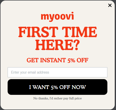
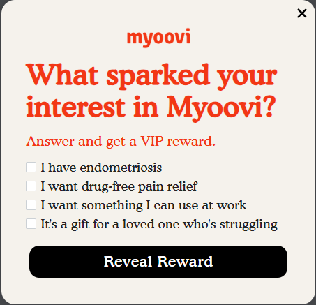
A teaser is a small widget or icon on the page that displays a hint of the offer. Once a user clicks, the sign-up form will open. This is very handy for those users who close the pop-up without paying attention to the offer. A small teaser showing the offer could be enough to entice them back to signing up.


Rather than asking for their email address straight up, give your visitors a chance to decide if they’re interested enough in the offer to sign-up. This will require a multi-step form, of which the first slide asks the question.
“Would you like 20% off?”
Give your user 3 options: variations “Yes Please”, “Maybe Later”, and “Not Now”. Yes and Maybe Later can move the user to the sign-up section, while Not Now can close the popup.
This makes your visitor feel like you’re respecting their wishes and giving them the final choice, rather than simply asking them to give you information.
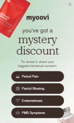
Mystery discounts create curiosity. This can be a good option if your offer is on the smaller side and not highly appealing on its own. Users might sign-up even if your offer is small because they’ve already invested some effort in the process.
FOMO can work extremely well, especially for seasonal offers that come around once a year. It can work on a regular sign-up form too, especially if you’ve got a good offer.
You can keep an eye on your form metrics for an overview of how each form is doing. These can be found within Klaviyo.

But your form metrics only tell half the story. Ultimately, you should be tagging new subscribers and excluding them from other marketing, so you can track customer info like:
All of these can be found within Klaviyo and will give you a much more advanced view of if your marketing is working, including your sign-up forms. Remember, your sign-up form is just one element of a successful funnel.
YOCTO’s Klaviyo audit services will help you streamline your email marketing strategy quickly and easily. Our team of email marketing experts dive into the corners of your Klaviyo account and find every aspect that could be optimized and improved.
Our advanced email marketing solutions include:
YOCTO is a Klaviyo Master Platinum Partner, so when you work with us, you’re getting expert insight, professional strategies, and a wealth of email marketing knowledge. Here’s why choosing YOCTO is an excellent choice:
Our team will comb every inch of your Klaviyo account and give you useful feedback, as well as easy-to-implement actions to fix issues. Here’s how the process works:
Ready to see what an expert audit can do for your email marketing performance? Book a discovery call now and get ready to double your success.
Do you need
to maximize your
profits?
